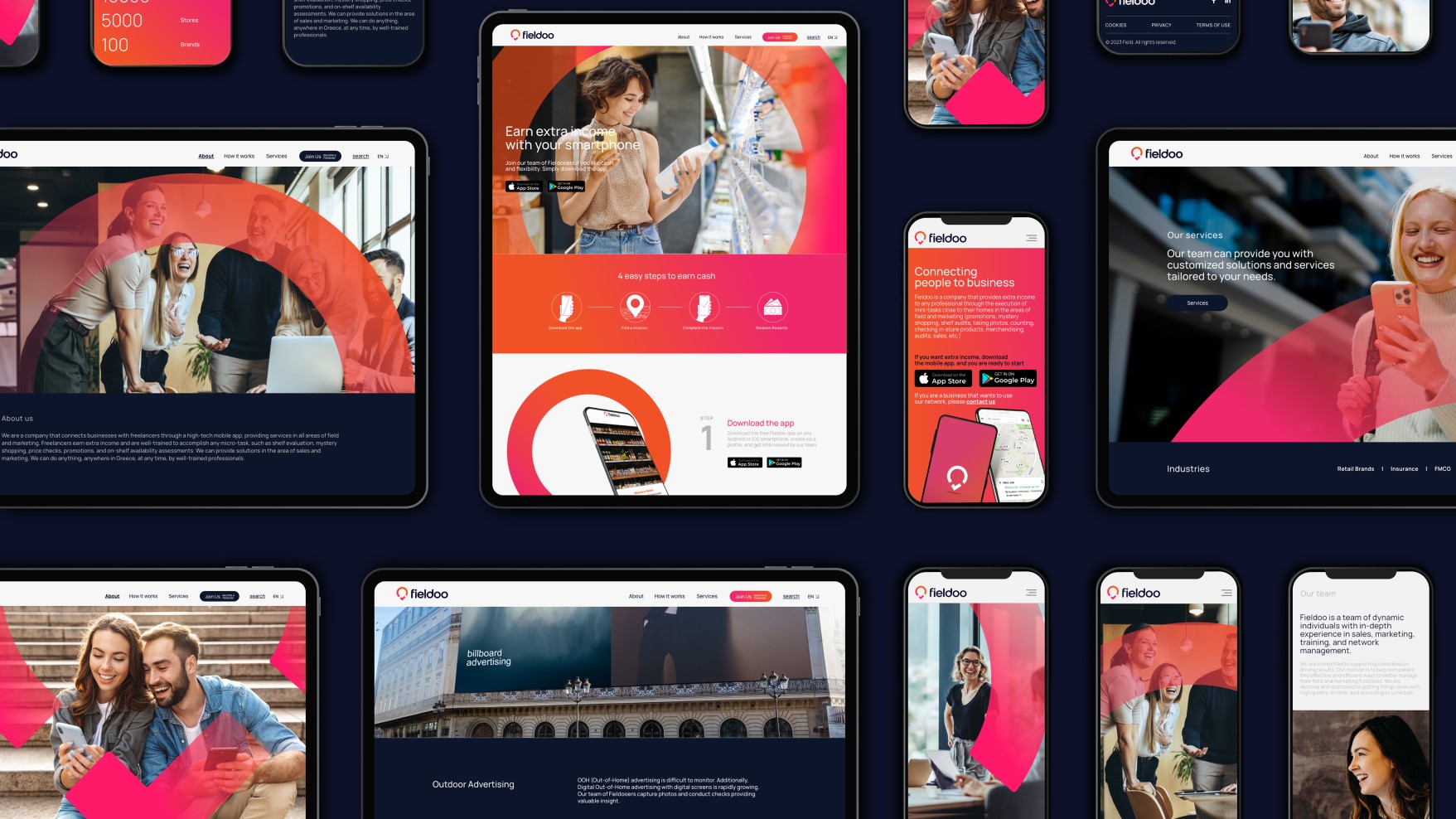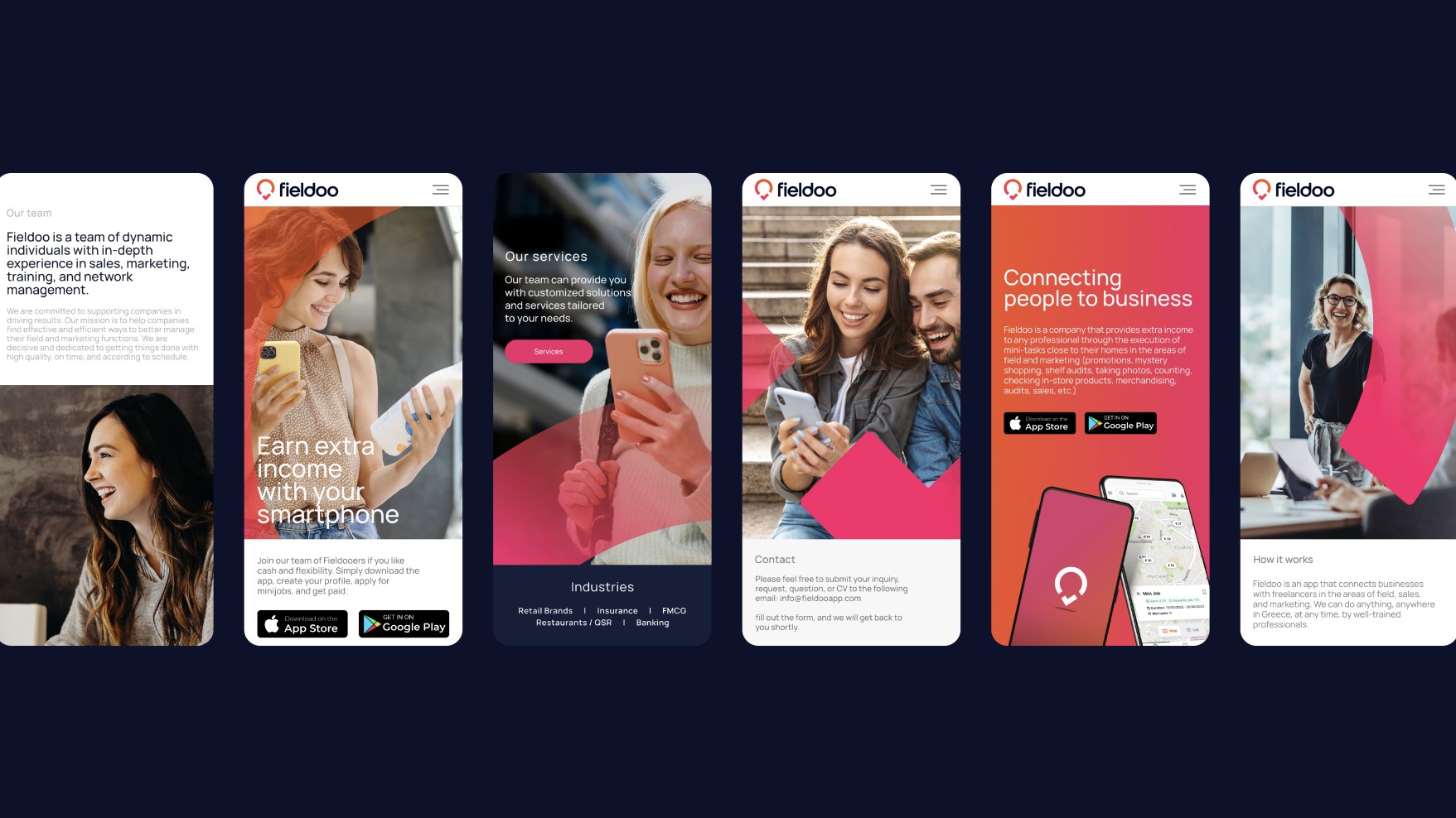
Fieldoo is the bridge connecting people to businesses. The name doesn’t just reflect the industry. It turns into action. It becomes information. It morphs into the person behind it.
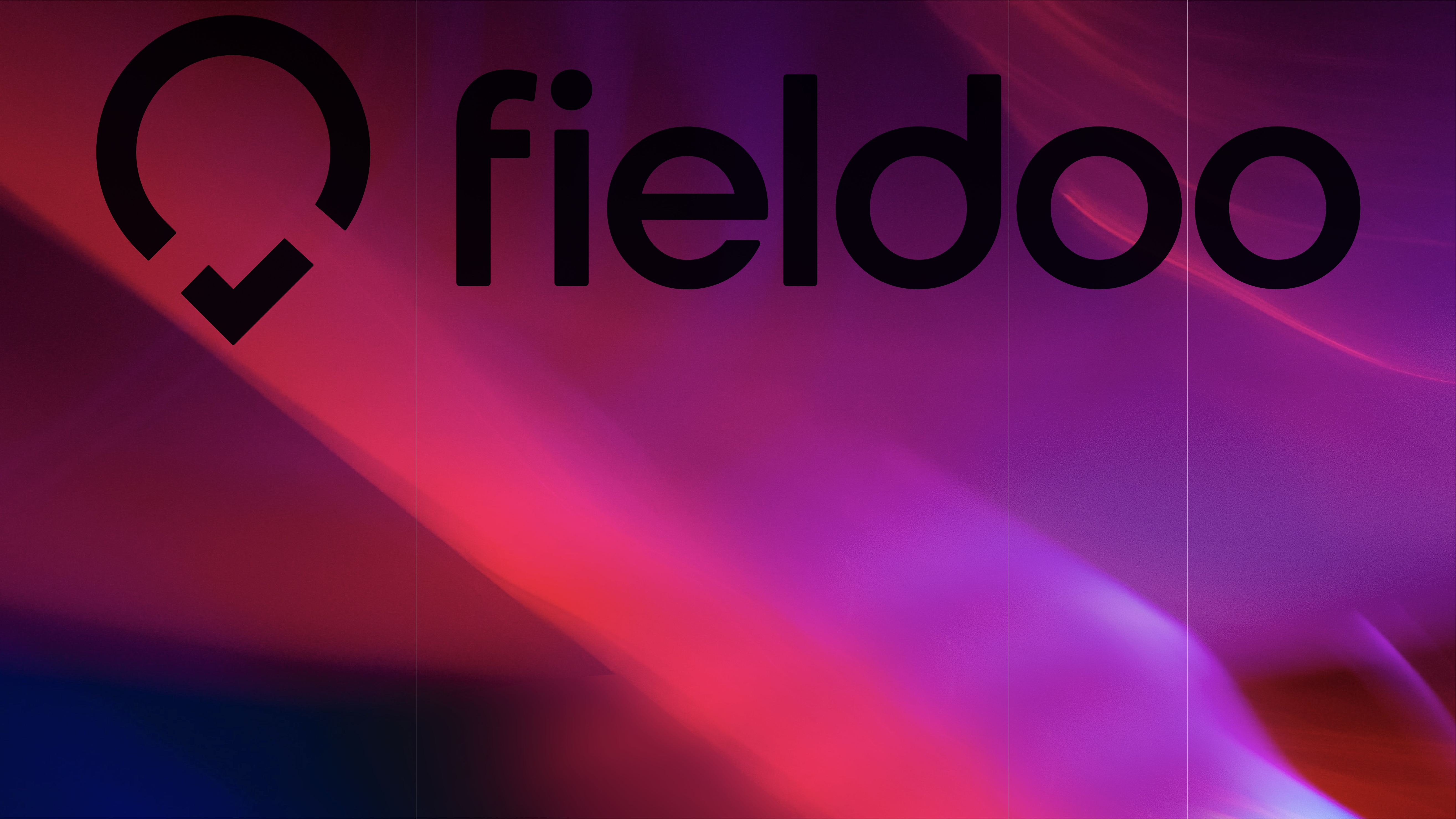
People are the centre of the Fieldoo logo universe, and around them unravels the place and the goals. The pin shows them the way. Whether a business or a Fieldoo freelancer, the power of the red points in the right direction. The final shape gets deconstructed. It obtains two meanings with its lower part checking the successful realisation of the goal and its upper part celebrating the people behind the action.
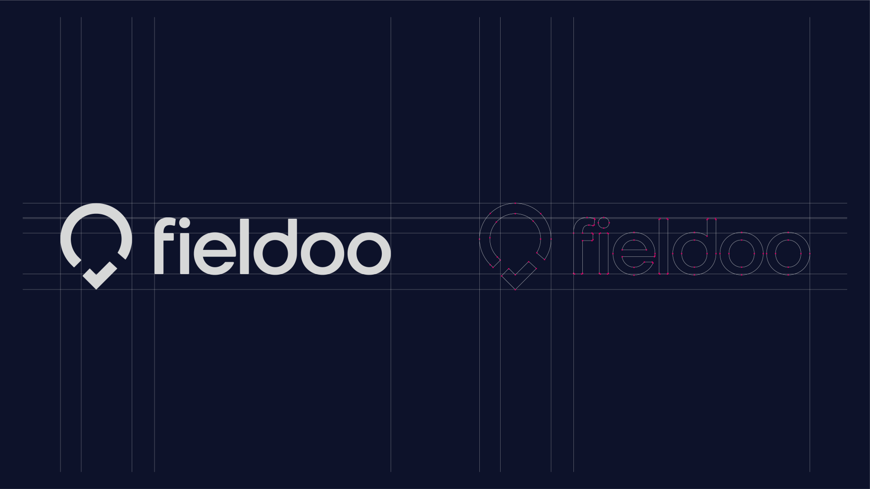
The design of the font creates two perfect circles. They are the ‘o’s in a ‘ooh’ of delight. They are also a pair of eyes seeking, checking, comparing, reporting and communicating. People get info and give info. People shape the environment they want to live in.
