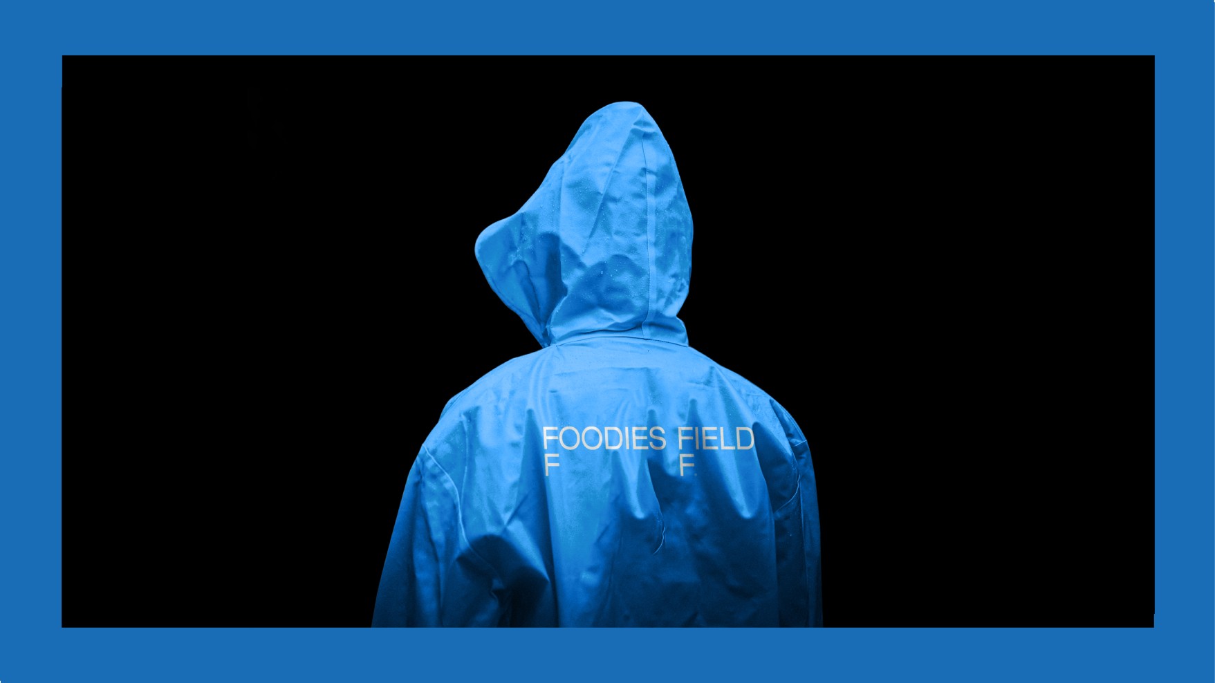
Crafting a brand identity for a company dedicated to empowering small producers and extending their reach globally resonates deeply with us. Envisioning wholesome and sustainable products, cultivated with care, reaching consumers worldwide, made us view it not just as a commercial strategy but as a noble cause.
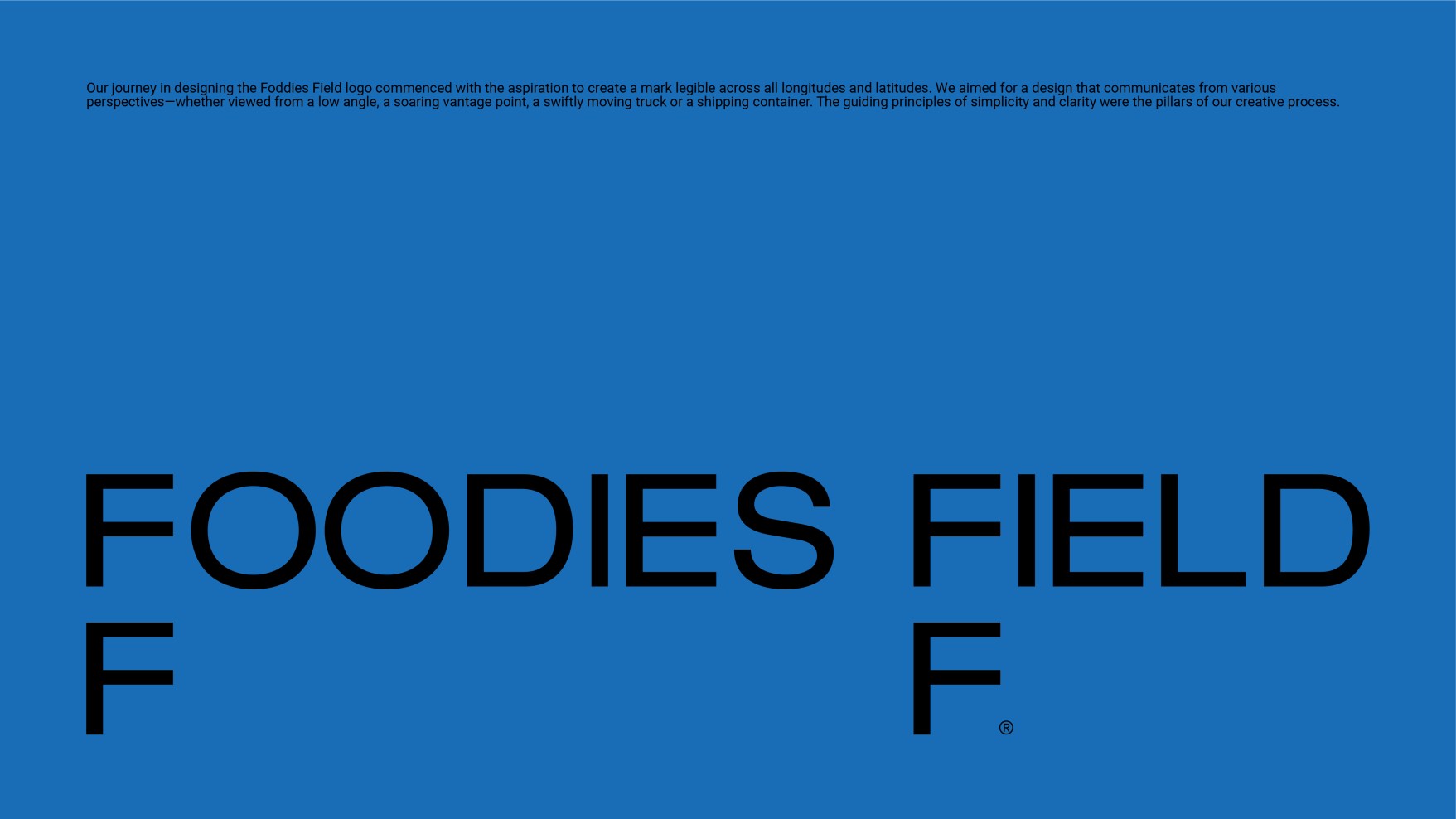
Our journey in designing the Foddies Field logo began with the ambition to create a mark that is easily recognizable worldwide. We aimed for a design that communicates effectively from various perspectives—whether seen from a low angle, a high vantage point, a swiftly moving truck, or a shipping container. The guiding principles of simplicity and clarity were the foundations of our creative process.
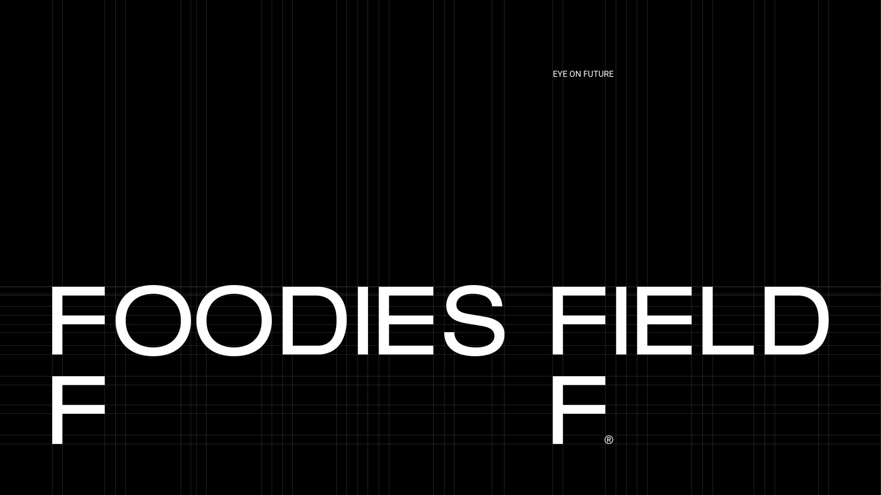
Just as Foodies Field charts the strategic trajectory from producer to distribution, we navigated through robust shapes and a sturdy framework. Within square shapes we housed notions like expertise, experience, equilibrium, technology, and logistics. The dual Fs in the logo provide a solid foundation, symbolizing the delicate balance between production and consumption. These Fs drive the logo to international markets. They transform into shelves ready to showcase great products. They also signify the Fair treatment of farmers, leading to a promising Future. The two Fs on the logo represent two points on a map—the distance between the grower and a market somewhere in the world, and the distance between the small producers' dreams and the validation of their worth as someone in another country enjoys the taste.
